Poetics of Space Presentation

Anonymity

For Mai and I’s presentation we wanted to talk about anonymity in Virtual Reality. Specifically we wanted to discuss the differences between social and private VR and what advantages and disadvantages their were to both mediums.  How can ‘good behaviour’ be encouraged or in some ways policed and how can you create ‘safe’ VR spaces?

One of the more interesting topics that I think we covered is the difference between anonymity – lacking individuality, unique character or distinction and pseudonymity – a false name or a state of disguise. I think the typical moniker ascribed to VR experiences is ‘anonymity’ but when it comes to social VR I feel that couldn’t be further from the truth. It’s not as if people are trying to disguise their own identity – they don’t usually mask their voices or anything like that – but instead seem to enjoy dressing up their avatars in different ways.

We discussed platforms and experiences like Alt Space VR, Facebook Spaces, Where Thoughts Go and VR Chat as well as an episodes of the Voice in VR podcast that talked with a talk show host from VR Chat. He addressed the community and how they’ve been dealing with ‘trolls’ and discussed how when friends meet in VR they will often go to a private space where they can interact which kind of blew my mind. It’s not enough to be in a VR space with someone – like a lobby or general meeting space – you then need to travel to a separate space to get away from the crowds.

Overall, I think the presentation went well and there was some very interesting conversation that came out of it. See below for the deck.


Immersion in New Jersey

The concept for this project was birthed by circumstance. This past weekend I visited the venue where I’m getting married in July – the Manor – for a food tasting. I thought it would be interesting to bring the rico Theta along with me to document the locations where major events of the wedding would take place. My partner Mai thought this was an interesting concept and we got to work.
 
 
Using the Theta, I captured the following images. https://360.vizor.io/v/jyjvl , https://360.vizor.io/v/xdwj7 , https://360.vizor.io/v/xdwj7 . Originally, the concept was to then place these in a 360 headset and show them to my fiancé Kristen, in the hopes that this view would illicit some sort of response. Ultimately, I ended up deciding against this as I felt her being present at the time of the photos ruined the intended illusion.
 
 
It was then that Mai and I came up with the idea to show the three different images to someone who wouldn’t attend the wedding with the hopes of making them feel as if they were invited. I admit I sort of set us up for failure by focusing on images that weren’t the same time of day as the wedding but this was more an interesting hurdle than a reason to pivot in a different direction.
 
 
Mai and I decided to use music to help with the immersive affect: Pachelbel’s Cannon in D for the first image where the ceremony would take place, Nina Simone’s “My Baby Just Cares For Me” – Kristen and I’s first ’song’ – for the second image where the reception would be and Bruno Mars “24K Magic” for where the after party would be.


The video goes in depth about Laura’s experience doing this but the take away that I found most fascinating was how engaging Laura auditory sense allowed her to defy certain factors that would likely prevent her from feeling immersed. The best example being that Laura started dancing during the “after party” image despite the fact that what she was looking at was taken during the early afternoon. Her movements ironically mimicked those of the attendees (at least I hope they’ll be dancing) which means, whether or not she was doing so ironically or not, Laura was immersed in the experience.

Perceptron Code

I used two different codes to make the perceptron. The first is from this blog post and the second is from some work I did with Stephanie Koulton.

import numpy as np

X = np.array([
    [-2,4,-1],
    [4,1,-1],
    [1, 6, -1],
    [2, 4, -1],
    [6, 2, -1],

])

y = np.array([-1,-1,1,1,1])

def perceptron_sgd(X, Y):
    w = np.zeros(len(X[0]))
    eta = 1
    epochs = 20

    for t in range(epochs):
        for i, x in enumerate(X):
            if (np.dot(X[i], w)*Y[i]) <= 0:
                w = w + eta*X[i]*Y[i]

    return w

w = perceptron_sgd(X,y)
print(w) And here is some of the code I created with Stephanie

import random
import numpy as np

def guess(sumtotal):
if sumtotal < 0:
return 0
else:
return 0

train_data = np.array([
([0,0],0),
([0,1],1),
([1,0],1),
([1,1],1)
])

biasinput = 1
weight = np.random.rand(2)
biasweight = np.random.rand(1)
const = 0.2

def perceptron():
x, expected = random.choice(train_data)
result = np.dot(x,weight) + np.dot(biasinput, biasweight)
print(result)
error = expected – guess(result)
print(error)
errors.append(error)
newweight = const*error*x
#delta = np.dot(x, error)
#print(delta)
#weight = weight + delta * const
#print(w)

perceptron()

Urban AR

There are a multitude of ways- theoretically – that an urban space can be enhanced by augmented reality. The question for me, personally, then is: will anyone care to use it? How can augmented reality be used by someone who lives a fast-paced urban lifestyle (my New York bias is showing here)? What honest New Yorker has time to stop, pull out their phone, open an app and show their phone something? Or let’s say we’re doing web based AR, what New Yorker wouldn’t just go to their web browser of choice to find out if their train is delayed or what place around them has the best slice of pizza?

     As it stands now, it seems as if AR is so much an “experience” that it can’t genuinely accommodate an urban lifestyle. With that said, this is only taking into account those with permanent residencies in urban centers, not those who play a part in keeping its economy afloat: tourists.
     The idea of an AR walking tour doesn’t seem too original (you may be sensing some skepticism in this post and I don’t blame you). However, what if AR could remove the rose-colored glasses and reveal the foundation of crime, greed and death that this city is founded on. Do tourists know that less than 30 years ago, Times Square was filled with prostitutes, pimps and pornographic cinemas? Does the NYU freshman relaxing in the shade in Washington Square Park know that hundreds were hung not 10 feet from him and their bodies could literally be at his feet right now?
      The question with which I’m yet to have an answer for myself however is: why? It’s difficult enough to create a lasting, meaningful AR experience so why focus on one that is so macabre? I think the answer to that is I may be too concerned with practicality and it may be fun – for once – to focus on a project that’s merely just fun for me to do.

K-Means Clustering with ERA and xFIP

Coding is not an easy thing for me. Learning Python, P5.js, C#, C++, etc have been no different than learning French, Japanese, or Dutch to me. I don’t say this to invoke pity but rather to explain why frequent examples of mine are about baseball. If I apply baseball sabermetrics (a passion of mine) to coding, the work becomes less ‘work’ and more an interesting study of baseball. This assignment was no different.

While the concepts of K-Means Clustering are something I’m a bit more familiar with thanks to Stephanie’s recording of your class and additional research, the notion of building a proper algorithm without a previously coded framework is really scary and daunting to me. Rather than try to code one myself, I figured it’d be a better usage of time to find previously existing code (to which of course I would site the creator of that code), and figure out interesting ways in which I could use it.

The code featured below was created by a YouTuber whose work is featured here. I chose this example because the author explained each line of code as he created it so I was able to understand what was happening a bit better.

For my data in this example, I decided to take two points from pitchers in baseball: ERA and xFIP. I’m sure you’re familiar with the former – ERA is merely earned run average or the total amount of earned runs given up in a game by a pitcher, divided by the number of innings he pitched and multiplied by nine – but xFIP might be a bit trickier to non-baseball nerds. xFIP is a sabermetric used to better determine the true ability of a pitcher. It is a metric that strips away the defense of the team the pitcher plays on, the amount of “luck” he has, and normalizes the amount of home runs he gives up based off of the league average. For a more in depth explanation, check this page out.

I took the ERA and xFIP from the top 10 American League and National League pitchers and turned them into X,Y data points. I then used the code below to create a K-Means Cluster and got this:

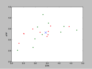
So the print function lets me know that the Cluster is located at (3.49, 3.34). My issue is I’m not sure what can be drawn from this information. Does this mean the average pitcher of the top 10 pitchers in both the American and National league has an ERA of 3.49 with an xFIP of 3.34? I’m fairly sure K-Means is different than a mere average but what does the information reveal?

Also, I’d love to figure out how to not just find two clusters (I know how to do that in the code, just change the number in kmeans = KMeans(n_clusters = 1) to 2) but to find the K-Mean cluster for the AL pitcher and NL pitcher individually.

Here is the code that was used for the above:

import numpy as np
import matplotlib.pyplot as plt
from sklearn.cluster import KMeans

_ALpitchers = np.array([
[2.25, 2.52],
[2.90, 2.65],
[2.98, 3.04],
[3.29, 3.24],
[4.07, 3.35],
[4.74, 3.44],
[3.09, 3.58],
[4.20, 3.61],
[3.55, 3.76],
[3.32, 4.15]
])

_NLpitchers = np.array([
[2.31, 2.84],
[3.49, 3.15],
[3.53, 3.23],
[2.52, 3.27],
[2.51, 3.28],
[3.20, 3.34],
[3.54, 3.38],
[2.89, 3.49],
[4.42, 3.60],
[3.64, 3.63]
])

kmeans = KMeans(n_clusters = 1)
kmeans.fit(_ALpitchers, _NLpitchers)
centroids = kmeans.cluster_centers_
labels = kmeans.labels_

print(centroids)
print(labels)

colors = [‘g.’,’g.’,’g.’]
colors_two = [‘r.’, ‘r.’, ‘r.’]

for i in range(len(_ALpitchers)):
print(“coordinate:”, _ALpitchers[i], “label:”, labels[i])
plt.plot(_ALpitchers[i][0], _ALpitchers[i][1], colors[labels[i]], markersize = 10)

for g in range(len(_NLpitchers)):
print(“coordinate:”, _NLpitchers[g], “label:”, labels[g])
plt.plot(_NLpitchers[g][0], _NLpitchers[g][1], colors_two[labels[g]], markersize = 10)
plt.scatter(centroids[:,0], centroids[:,1], marker = ‘x’, s= 150, zorder = 10)

Midterm: Continuation of Vinyl Project

For the midterm, Scott and I decided to continue working on the project we started a few weeks ago referenced here.

We really love the notion of an AR app that serves as a compendium to a vinyl purchase. In our minds, a user would go to a record store, buy a vinyl and receive both the download code for the records MP3’s – a practice already being used – and a download code for  this app. Each app would be specifically catered to the vinyl purchased. We already vaguely fleshed out this idea with Bowie so we wanted to try a different album: Radiohead’s Kid A. 

Rather than approach this album thematically like we did with Bowie, Scott and I wanted to work from a more technical standpoint. Scott was really interested in API integration while I was interested in a more immersive AR experience. Scott likely goes into the API work in his post so I’ll focus on the immersive nature.

As of now, I think it’s really jarring to see AR images overlaid on top of other images. After the novelty wears away, it just seems kind of hokey. I’m interested in AR experiences that make the user look twice. For example, for this particular album cover featured below, I wanted to augment the actual mountains.

In my head was an experience in which a user would point their phone at the album and seemingly see …the album cover and nothing more. I wanted them to feel as if the app was broken or wasn’t working. Then I wanted something to happen – the ice on the mountains begin to melt, the sky begins to move – that made them look closer. 

For Kid A, Radiohead released a dozen or so short videos, all of which are featured below in the compilation. 

Scott and I took the video featured at 9:14 and figured it would be perfect to augment on the cover. Scott took the album cover, made the mountains transparent in after effects and placed the video of the moving mountains over it. The result was the following:

 While the rest of the project is done, I don’t have video documentation as Scott has the album tonight BUT I can describe what else was included: 

  • A full video augmentation of the album cover starting with above and ending with other Kid A blips 
  • A back album that uses Vuforia Buttons to toggle between the influences of the album. For example, touch one button and see which Charles Mingus album influenced Kid A, touch another and see which Aphex Twin album influenced Kid A, etc.
  • An API with 3D text that shows related artists you could listen to if you’re into this particular album
  • Videos from the band describing the process of recording Kid A. 

Excited to show you all of this tomorrow!

Baseball: Object As Container

For my object I decided to use a baseball. At first thought I was reticent to use this because at first glance it doesn’t seem to have too much personality. After all, the object is mass produced with the intent of being the same in every aspect. However, there’s something about a game-used baseball that does give it plenty of personality. If you’ve ever caught a foul ball for example, there are scuffs where the bat has made contact that gives it a distinct feel. Each scuff builds to the creation of a memory of the moment in which the ball was caught. This isn’t to mention the symbolic nature of a baseball itself. A fan of the game, upon seeing a baseball, instantly associates it with something much more than cork wrapped in yarn. Alex Zimmer and I wanted to use this as a jumping point.

Originally we had two ideas: imbue my object with a memory or augment a baseball scorecard. The latter was to be a backup option lest Vuforia’s object scanner fail to work properly.  

Let me start by saying that it isn’t so much a pain in the ass to use Vuforia’s object scanning software, it’s more of a pain in the ass getting on an Android Phone. Vuforia only allows this to be loaded on to Galaxy Note 6’s and 7’s. Luckily, work has a Galaxy 7 that I was able to borrow. After spending like 20 minutes trying to figure out how to get the SDK software onto the phone – I’m a lifelong Apple user – I went home to try to scan the baseball. After opening the software and wondering why it wasn’t working I checked the documentation only to see that apparently a piece of paper is meant to accompany the scanned object. 

I went to school, printed the gray piece of paper and tried scanning with Alex. Our first scan was sort of successful as we gathered about 200+ points. We found we had some success once we tried to augment a cube onto the object but it was really inconsistent. Alex and I thought if perhaps we wrote something on the ball in permanent marker, this would give the object scanner more to work with. I got a brown sharpie and wrote “Home Run” on one side and “Dad and I” on the other. This scan revealed about 400+ markers and was a lot easier to pick up in Unity.


Now that we had the object scanned we knew we’d have success augmenting it the way we wanted. 

At every baseball game a fan walks away with a ball as a souvenir. Sometimes the ball was a foul, sometimes it was a home run, sometimes a player tosses it to someone. Either way a fan usually ends up cherishing this ball be it for the remainder of the game or for the remainder of their lives. Alex and I wanted to take the means in which the fan received the ball and make it a memory of the ball itself by augmenting it. 

Alex and I found the above clip – a very famous home run hit a few years ago – and made sure it was from a fan’s perspective (we couldn’t find one from the perspective of the fan who caught the ball) and augmented it on the ball. Having merely placed a plane with a video player on the ball wasn’t enough though. We wanted to give the impression that the ball that we were augmenting had the memory that caused the fan to receive it inside of it. Almost like an egg or a …pokeball. The final result is attached below. 

Materials

For the final foray into my Butchers Crossing environment I had two things in mind: figure out how to use Substance B2M to incorporate a material on the three horses in my scene and correct the scale of the bison/humans/horses in the scene.

I started by searching the internet for tileable furs that I could use for my horse. I found a few and ended up choosing the one featured at the top of the post. 

Integrating the jpg into B2M was really easy, intuitive and fun to mess around with. The only real issues were the ones that happened once I got back into Unreal and had more to do with my hardware than Unreal’s software. 

Once the material was exported from B2M and placed into Unreal, I messed around with the Texture samples and Texture coordinator, tried masking out different colors and so forth and so on but the differences were so minimal that I didn’t feel as if they really needed to be integrated. Once the fur was actually put on the horse, I wasn’t too pleased with the appearance though I think that may have been as a result of the tileable jpg that I went with. 

In these first five or so weeks of class I have certainly learned a lot about Unreal but the biggest takeaway is that Unreal is not meant for Mac’s. Sure, a Mac can run Unreal and you can use the foundational tools like landscape pretty well but when it comes to getting more advanced and integrating characters, animations and materials, you spend more time waiting for shaders to compile or animations to load than you do actually setting up the atmosphere of your scene.

For example, in the movie featured above with the fur material placed on the horse, it doesn’t look that great because of my graphics card. The characters are more of a study in glitch than they are an exploration of realism. 

I was able to adjust the things that were a bit more under my control though: I corrected the scale of the bisons, characters and horses. I adjusted the trees and bushes a bit to make the environment a bit less sparse, too. 

With all that said, I am glad that I got the skills that I did because I feel like the only thing that is holding me back with Unreal is my hardware.  

Magic Windows: David Bowie

"There's a Starman, Waiting in AR"

For this project, Scott Reitherman and I teamed up to create an “app” that we’re actually really excited about. Both Scott and I are big into music; we collect vinyl, talk about album histories and enjoy introducing one another to new genres (Scott’s more ambient and I’m more funk). We thought it would be cool to create an app that brought the stories of albums to life; one that gave the listener a greater sense of what went in to making a particular album. There’s a small book series called 33 1/3 which tells the entire story of an album in a small 100ish page novella and I think we thought it would be cool to essentially turn one of those into an augmented reality experience that took place in and on the album that was being focused on.


I think it all started with Bowie. Scott approached me after class and said he had an idea involving augmenting vinyl. He mentioned maybe doing this with a Bowie album. Being a big fan of the Thin White Duke myself, I thought this was a great idea. I added that rather than just showing users random images from when the album was made it would be interesting to have those images tell a story in an of themselves. For example, if we did Bowie’s last album, “Blackstar” it would be cool to have the augmented images slowly fade into death as the user advanced through the album.

Scott and I settled on an vinyl he owned that was called Ziggy Stardust: The Motion picture. We chose this album because the inside had separate images that we thought we be better to augment other images on.  Here is the final product (a correctly oriented video will be updated soon, just wanted to get this blog post up):

Unity Does Not Like Videos...

There were a lot of difficulties making this project all centering around adding video to Vuforia. While getting the proper scripts in place wasn’t too difficult, getting the video to play along with the audio was an extremely laborious task that took up 90% of the projects time. The issue seemed to be with the codec and dimensionality of the videos. They all needed to be 640×360 and if they weren’t the audio would play but not the video. When we tried re-orienting these videos in Premiere we would also have issues where the video wouldn’t play (but the audio would) while holding your phone vertically, but would play properly while holding your phone horizontally.

We also ran into issues with how the video was uploaded in Unity. At first we thought it was ok to drag and drop the videos (mp4’s) into the Streaming Assets folder but then we realized we couldn’t make any adjustments to them. Then we tried uploading the videos into the assets folder which seemed to be the correct move, or so we thought. Turns out the video needed to be transcoded (thanks to Gabe for the help with this). After THAT was figured out, we still had some issues but after a bit more trouble shooting we got it to work.

Future Improvements

Scott and I spent so much time making sure the videos work and that we had the proper content that we weren’t able to complete what I think is one of the more crucial elements of the project: additional story-telling. While the evolution of the augments follows a particular story, there are certainly subtleties that I want to imbue in the project that I think we could’ve done with more time/less technical issues. For example, I love the video on the cover, I love the story it tells; it’s a perfect introduction. However, I wish it had smoke coming from the top of it to tie in the fire coming from the cover. I also wish the videos would get more frantic and cut in and out more to show Bowie losing his mind as his success increased. 

Overall though, I’m really pleased with what we got and I’m eager to take the next steps with this app as I think it could be an interesting, non-novelty-driven exploration of augmented reality. 

The Best Laid Plans of Mice and Men…

Big plans. That’s what I had this week for my Unreal Project this week. I was going to get some new animations of a one-armed man loading a saddle onto a horse and then dramatically turning to the right or left as if hearing something in the distance. I was going to finally fix those crazy proportions in my scene (goodbye abnormally large bison). I was going to upload a new horse I found in Unity that had actual texture. I was going to find a good sample of a coyote howling off in the distance and match it perfectly with my new animation. What did I get instead:

Jesus christ….To quote Beckett, “Try again. Fail again. Fail better.” Unfortunately, I got stuck on the second sentence of that quote. Here’s how it happened.

I’ll spare you the details of the lab as you were there for it. I will say you definitely had my sympathy. Can’t imagine the pressure of a software not working when 20+ students are coming to use it and base their homework off of it. Had the software been functioning properly, I was interested in getting one animation: a one-armed model walking up to a horse, picking up a saddle (it would’ve been a sandbag in this case), propping it up onto a horse (stool), adjusting it for a few seconds before “hearing something in the distance” (turning their hard sharply). I definitely plan on trying to get that in the future.

Unable to get the animation I was looking for, I decided to pivot and use a simple walking animation we cleaned up last week. Unfortunately, that walking animation didn’t end in a t-pose but was instead abruptly cut off mid stride. I figured this was all exploratory though so I made a new Mixamo character, put it in motion builder, characterized those hips and brought the animation into my Unreal scene. My poor Mac, the more I give it the more I struggled. Rather than a full character, I got a choppy one who was missing parts of his head, shoulders and waist. It would have to do.

Next came the part that I was sure would be the simplest and would be the most difficult: causing the walking animation to trigger a sound clip. There’s no reason this should’ve been as hard as it was. First, I tried a tutorial I found online but after about an hour of the coyote playing every time the scene started (I checked the blueprint thoroughly), I decided I’d go with your video from the last class. I thought that even though you focused on turning on a light, triggering a sound wouldn’t be too different. I played around with different nodes but couldn’t have any success. I’d either hear the coyote from the beginning of the scene or never at all.

Frustrated, I called Kat over and we sat looking over Unreal for a good 20 minutes. She instructed me to insert a console log that would display a message when the character walked through the trigger. We tried that but still had zero success. At this point we both called it quits as it was around 8 and I’d been on the floor struggling with that other gaming software for hours.

Deep down, I fuckin’ knew it. I knew there was something with the character not being a trigger. That’s the only reason that could explain the console log message not appearing. At the end of the day, I’m glad the situation was resolved even if it meant toiling over Unreal for hours only to have my problems be solved literally by the click of a button.

I really do look forward to making this scene what’s in my head: an exploration of subtlety.